Introduction
Wowdash
Wowdash React Js, Next JS, ShadCn, TypeScript & Tailwind Admin Dashboard
Created : 11 August 2025Last Update : 21 November 2025
By : wowtheme7
Thank you for purchasing Wowdash Next JS, ShadCn, TypeScript &
Tailwind Admin Dashboard If you have any questions that are beyond
the scope of this help file, please feel free to email, via my
user page contact form or put a ticket at Support Center . Thank
you so much!
Wowdash is a modern, responsive, and fully customizable admin
dashboard built with Tailwind 4. It is designed to cater to a wide
range of web applications, including admin panels, project
management systems, CRM, CMS, and e-commerce dashboards. With its
clean design and extensive features, Wowdash provides a robust
foundation for any backend application.
Setup Development Environment
- Install recommended version of NodeJS
- This is a Next.js project bootstrapped with create-next-app
- Use this command line on the terminal to navigate to the project root directory.
-
Run those following commands.
-
npm run dev
# or
yarn dev
# or
pnpm dev
# or
bun dev
# or
-
npx shadcn-ui@latest init
-
npx shadcn-ui@latest add button
- You will now see the website live.
- Build the project using this command.
-
Run those flowing commands.
-
npm run build
setup and config authentication
- 1. Install Dependencies auth js Auth.js
-
-
npm install next-auth@beta
-
NEXTAUTH_SECRET=your-secret-key
NEXTAUTH_URL=http://localhost:3000
-
npx auth secret
-
1. Go to https://console.cloud.google.com/
2. Create OAuth 2.0 Client ID
3. Add the keys in `.env.local`:
GOOGLE_CLIENT_ID=xxxx
GOOGLE_CLIENT_SECRET=yyyy
4. Run the dev server: npm run dev
   import NextAuth from 'next-auth';
import Google from "next-auth/providers/google"
import GitHub from "next-auth/providers/github"

export const { handlers, signIn, signOut, auth } = NextAuth({
  providers: [
    Google({
      clientId: process.env.GOOGLE_CLIENT_ID,
      clientSecret: process.env.GOOGLE_CLIENT_SECRET,
    }),
    GitHub({
      clientId: process.env.GITHUB_CLIENT_ID,
      clientSecret: process.env.GITHUB_CLIENT_SECRET,
    }),
  ],
})
All Pages
- Home AI
- Home CRM
- Home eCommerce
- Home Crypto Currency
- Home Investment
- LMS / Learning System
- NFT & Gaming
- Medical
- Analytics
- POS & Inventory
- Finance & Bank
- Booking System
- Help Desk
- Podcast
- Project Management
- Call Center
- Email Details
- Chat
- Typography
- Colors
- Buttons
- Dropdown
- Alert
- Card
- Avatar
- Progress Bar
- Tab & Accordion
- Pagination
- Badges
- Tooltip & Popover
- Star Ratings
- Tags
- List
- Radio
- Switch
- Input Forms
- Input Layout
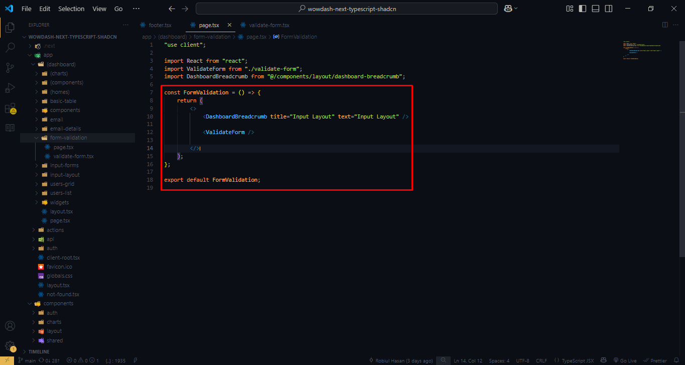
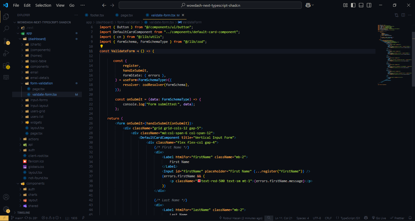
- Form Validation
- Line Chart
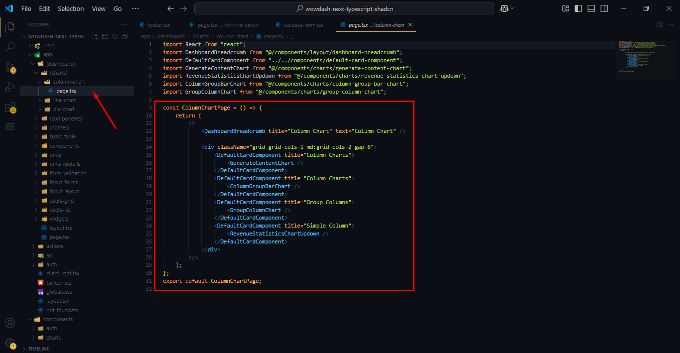
- Column Chart
- Pie Chart
- Widgets
- Basic Table
- Users List
- Users Grid
- View Profile
- Sign In
- Sign Up
- Forgot Password
- Company
- Notification
- Notification Alert
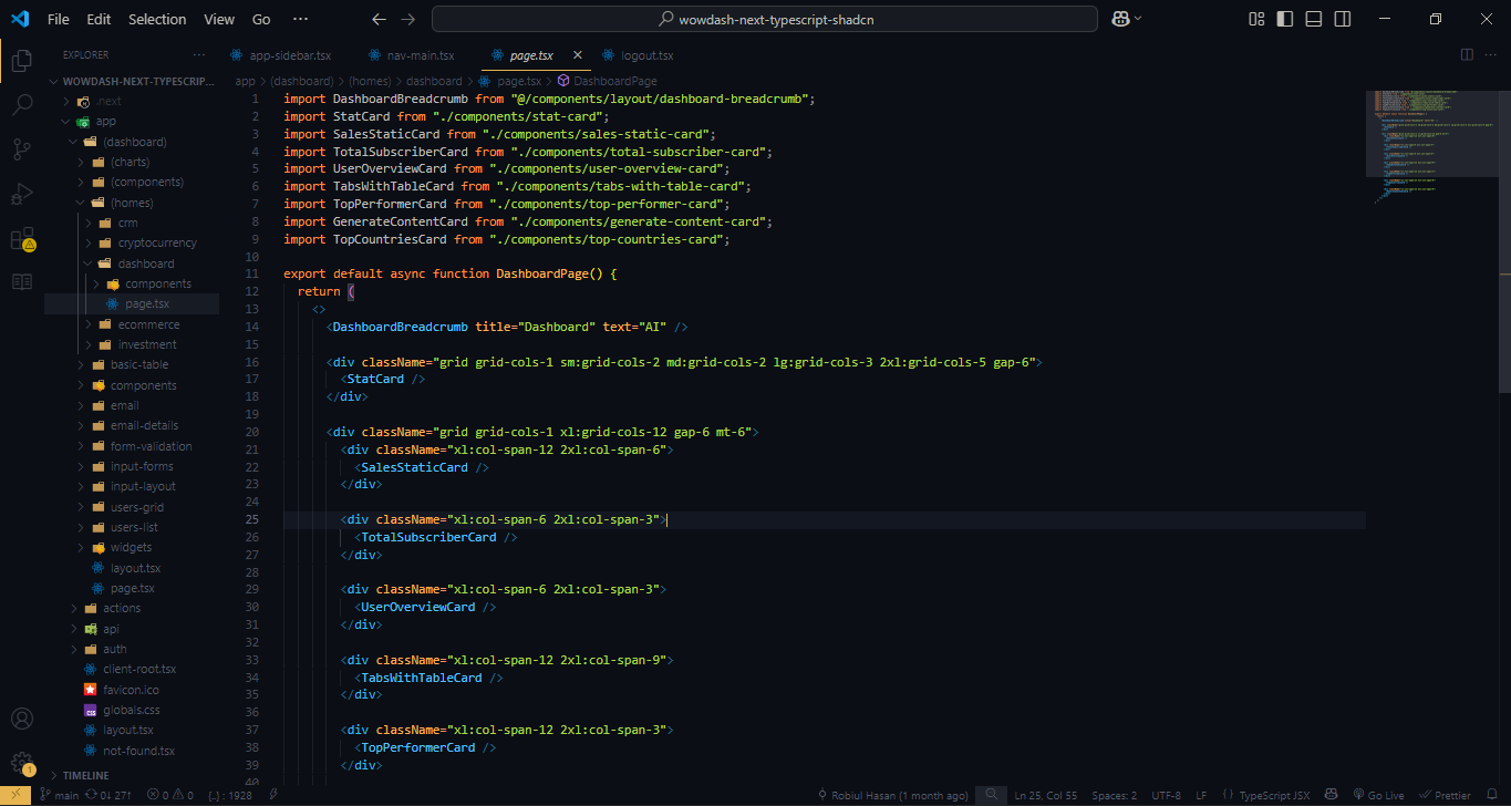
Next tsx Structure
The Next template uses Latest Tailwind 4 with valid HTML5 tsx tags. This theme is a responsive layout with 4 column Support column. All of the information in content area is nested within a class and comes with predefined classes.
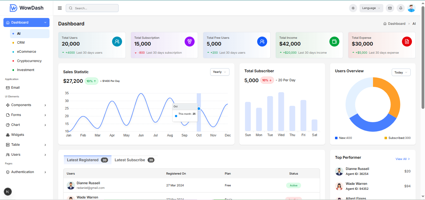
Output
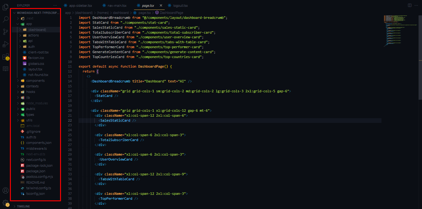
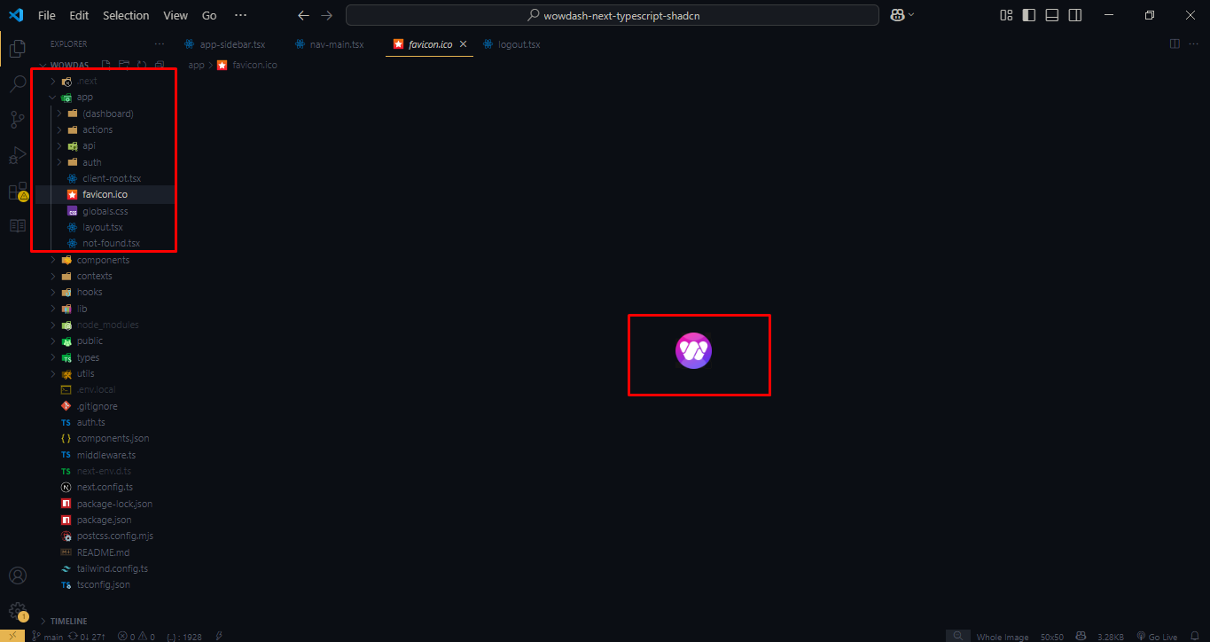
Project Folder Structure
Main file & folder structure of this theme.
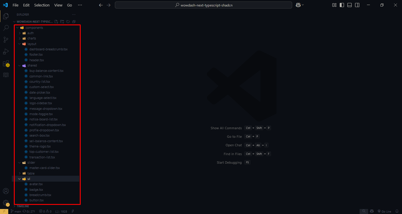
The project folder structure is organized to ensure clarity and scalability. Each major section of the theme is separated into its own folder, such as assets, components, pages, and styles. Understanding this structure will help you quickly locate and modify specific parts of the project as needed.
Customization
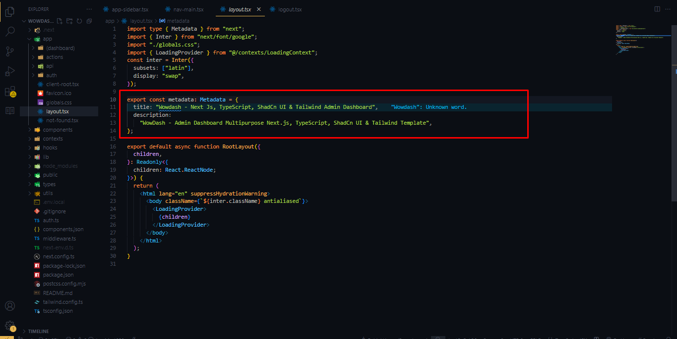
Change Meta Tag :
Change favicon :
Logo Structure
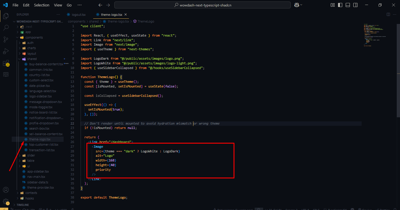
Output

App Structure
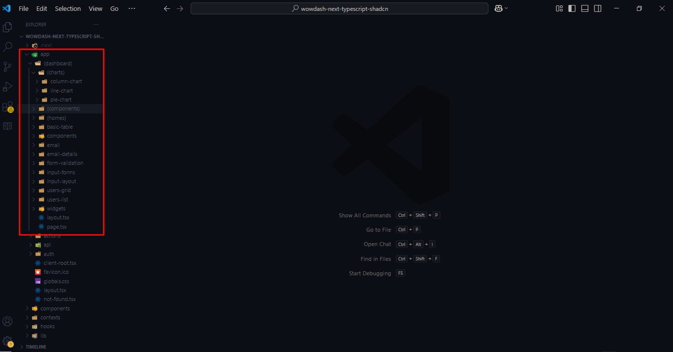
Component Area Structure - Layer & child
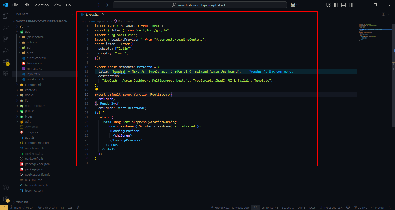
Root Layout Structure
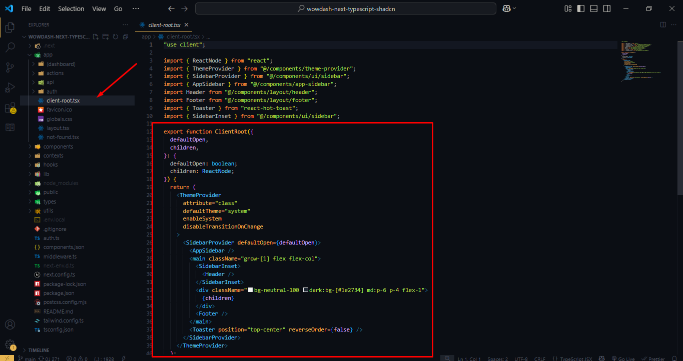
Client Root Layout Structure
Footer Menu Structure
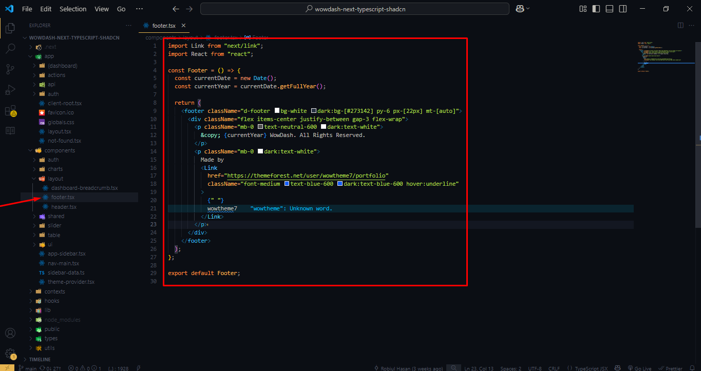
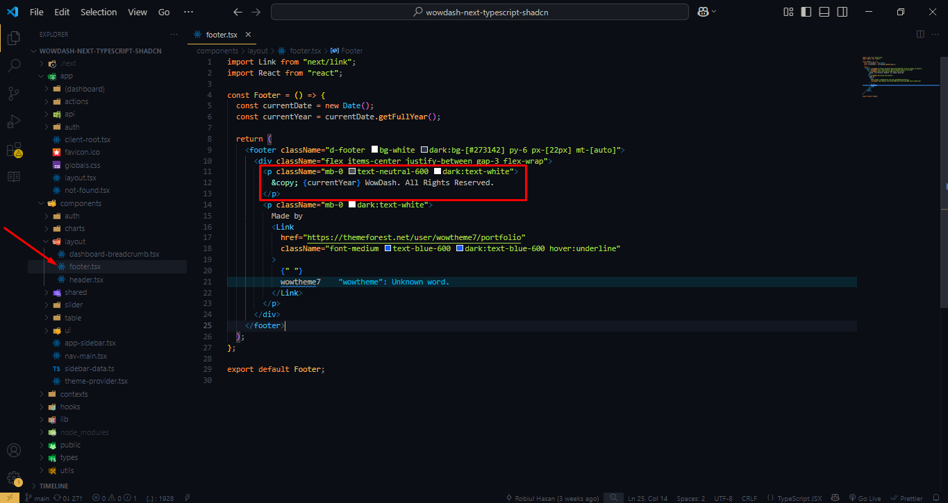
Copy Right Structure
Form
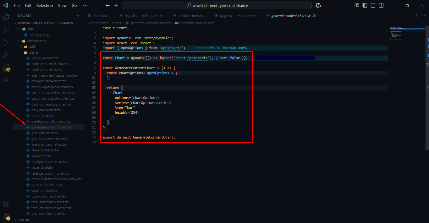
Charts
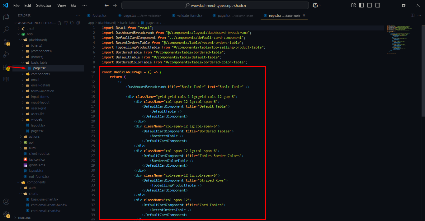
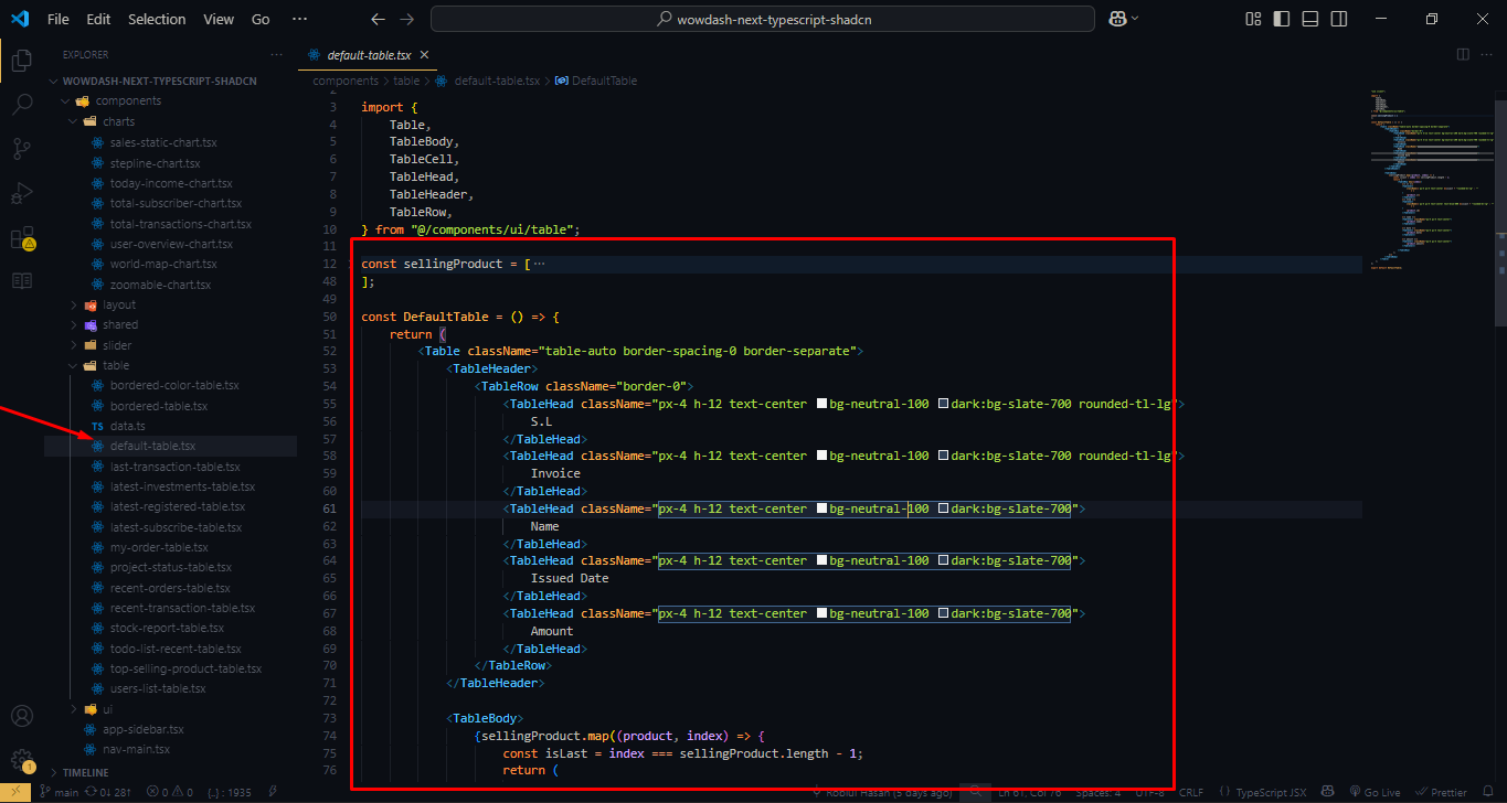
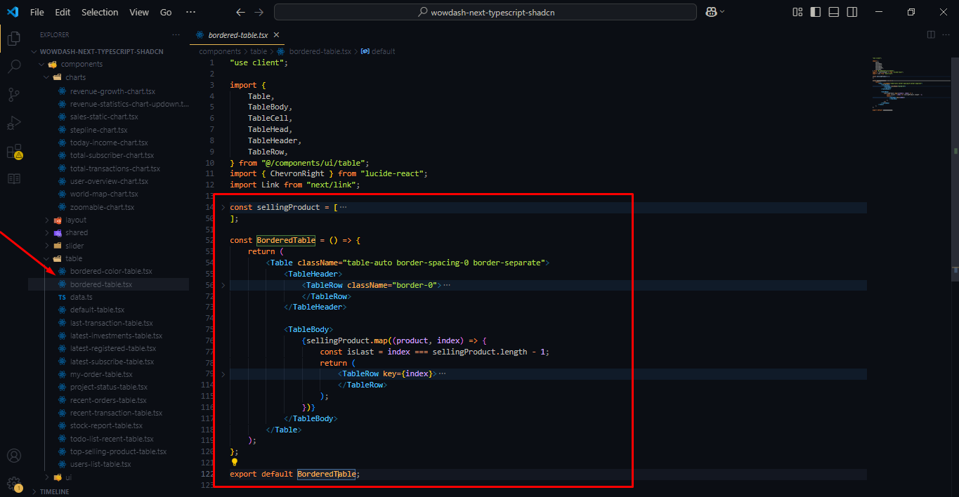
Table
Features
Wowdash leverages the latest Tailwind 4 framework, ensuring top-notch performance and up-to-date features. Enjoy the benefits of Tailwind's powerful grid system, modern design, and extensive customization options.
Designed to be fully responsive, Wowdash ensures a seamless user experience across all devices, including desktops, tablets, and mobile phones. The retina-ready design guarantees crisp and clear visuals on high-resolution screens.
The template features a sleek, modern design with a clean layout. It provides an intuitive user experience, making it easy to navigate and interact with various components.
Wowdash offers extensive customization options, allowing you to tailor the dashboard to meet your specific needs. Change colors, layouts, and components with ease to match your brand's identity.
With a wide range of UI components, Wowdash provides everything you need to build a functional and attractive admin dashboard. This includes charts, tables, forms, buttons, icons, and more.
Wowdash includes multiple dashboard layouts and variations, catering to different types of applications. Choose the layout that best suits your project requirements.
The template comes with both dark and light mode options, providing flexibility and enhancing user experience based on preference and environmental lighting conditions.
Wowdash integrates with popular chart libraries, providing advanced charting capabilities. Visualize data with interactive and customizable charts and graphs.
A variety of pre-designed widgets and cards are included, allowing you to display key metrics, notifications, and other information in a visually appealing manner.
Comprehensive form elements and validation features ensure accurate data input and user-friendly forms. Customize forms with various input types, validation rules, and error handling.
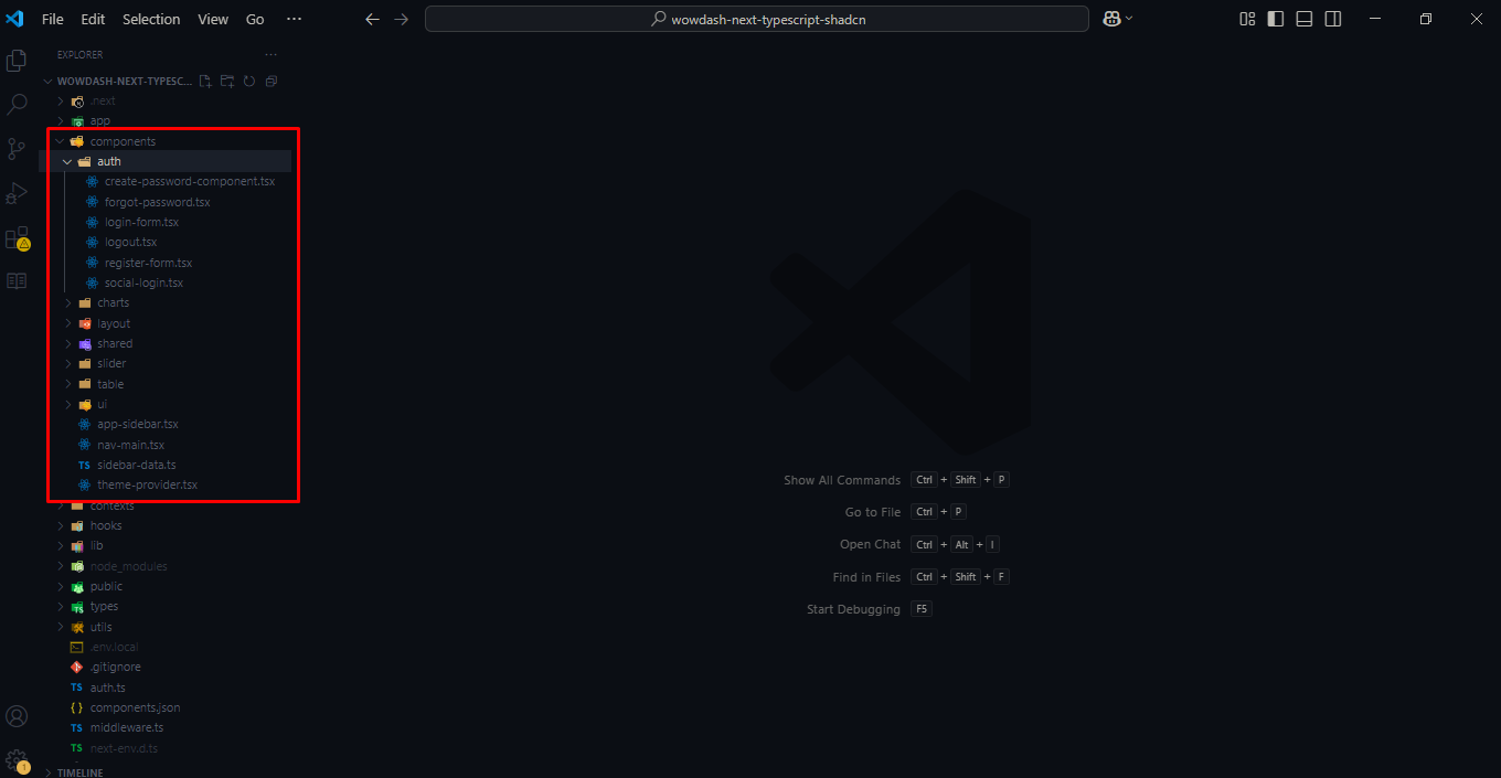
Ready-made authentication pages, including login, registration, password reset, and lock screen, provide secure access management.
Regular updates ensure that Wowdash remains compatible with the latest web standards and technologies. Dedicated support is available to assist with any issues or customization needs.
What's Included
- Dashboard Layouts: Multiple variations for different use cases.
- UI Components: Buttons, cards, modals, tabs, alerts, and more.
- Forms and Tables: Advanced form elements and table designs.
- Charts and Graphs: Integrated with ApexCharts, and other libraries.
- Tables: Data tables with sorting, filtering, and pagination.
- Widgets: Customizable information widgets.
- Authentication Pages: Login, registration, and password recovery templates.
- Icons: A wide selection of icons for various uses.
- Utilities: Helper classes for spacing, alignment, and more.
Ideal For
- Web Applications: Developers building web applications needing an admin interface.
- Analytics Dashboards: Businesses requiring a powerful tool to visualize data and metrics.
- Management Tools: Teams looking for an efficient way to manage projects and tasks.
- E-commerce Platforms: Online stores needing a robust back-end for managing sales, inventory, and customers.
- SaaS Applications: Software-as-a-Service providers requiring a versatile and customizable admin dashboard.
Sources and Credits
Fonts Used int the template are google fonts, you can find theme on Google Fonts API
Font Used:
NPM plugin:
- Tailwind
- React Hook Form
- Zod
- Date FNS
- React Lucide Icon
- Apexchart
- React Hot Toast
- React Simple Maps
- React Carousel
- Radix Ui Avatar
- Radix Ui Checkbox
- Radix Ui Collapsible
- Radix Ui Dialog
- Radix Ui Dropdown
- Radix Ui Label
- Radix Ui Popover
- Radix Ui Progress
- Radix Ui Radio
- Radix Ui Select
- Radix Ui Separator
- Radix Ui Slot
- Radix Ui Switch
- Radix Ui Tabs
- Radix Ui Tooltip
Every Code is properly commented for Editing Ease.
Support
Once again, thank you so much for purchasing this theme. As I said at the beginning, I'd be glad to help you if you have any questions relating to this theme. No guarantees, but I'll do my best to assist. If you have any queries, please feel free to contact us at Support Center. support@wowtheme7.com
Email Us at : support@wowtheme7.com